Using Wayfinding to Create A Better User Experience
Nobody wants to feel lost. If your customers, visitors, or patients aren’t able to easily and quickly navigate your organization, they will feel frustrated and annoyed. As a result their user experience suffers.
Wayfinding is one of the first ways your audience interacts directly with your brand. Do it right and you set the course for a positive, fulfilling, and memorable experience.
Benefits of Wayfinding
- It allows the user to drive. Patients, visitors, and other users don’t have to depend on finding someone to ask for directions, so they are empowered to forge their own unique experience.
- It’s inclusive. Interactive wayfinding caters to everyone, regardless of if they speak a different language, are hearing-impaired, low vision or blind, or possess other physical disabilities.
- It provides deeper information. Digital wayfinding can share more information than regular signs. Add promotional material, points of interest, and upcoming event announcements along with directions to engage the user.
- It’s flexible. Each wayfinding element can be accessed from a single screen. It can also be changed often and rapidly to convey the most up-to-date data available and react to the change in flow of traffic at different times or days.
But how can your organization implement wayfinding so it functions
effectively? One of the tools you can use to enhance the experience is
digital signage.
Here are 7 tips for using digital signage to redefine and improve wayfinding to create better user experiences.
Keep Maps Simple
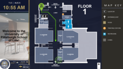
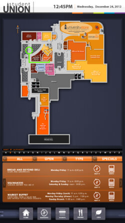
Too much information and detail can confuse your audience. Create your maps with the most important, highly-trafficked areas first. Make those destinations obvious and easy to locate. Only mark the areas that are user-accessible or helpful for wayfinding. Lay out point-to-point directions and utilize colors and graphics to help them visually understand the paths.
If your location split into different areas or regions, use different visuals for each one. This shows the user they are leaving one area and entering another.
Use Text Judiciously but Effectively
Today’s consumers don’t want to take time to read a bunch of text to figure out where they need to go. Employ icons and color patterns for certain areas and use minimal text as needed to convey the main points. Before using words to guide your users, see if you can think of a symbol or picture to use instead.
Depending on your audience, you may want to add text in languages in addition to English. One option is to make your wayfinding interactive so the user can choose the language they wish to operate in.
Embrace White Space
Wayfinding tools that contain too much text and pictures end up looking like a jumbled mess that users don’t understand. These are not effective. Aim to be more of a billboard and less of a book. Add clarity to your wayfinding by avoiding print that’s too small and pictures that are too close together. By employing breaks in between the text and pictures, you give your users a way to digest the information easier and faster without getting overwhelmed.
Visually Engage the User
Your patients, students, or visitors will consume the majority of your wayfinding plan through their eyes. Entice them by making it pretty!
Carefully plan the colors you will use in your design. Choose pictures and symbols that are appealing and cohesive so they complement each other. Pick a font for your text that is easy to read and clear.
By creating your wayfinding design in a visually appealing, easy-to-read way, users are more likely to find it helpful to their visit.
Speaking of helpful, make sure to…
Create Intuitive Paths
Don’t lay out Point A to Point B and think you’re finished. Make a pathway that’s easier to follow than that. Allow the maps to slowly route from one location to the next. A seamless, flowing route helps your users familiarize themselves with their location in relation to their destination.
Use landmarks that are highly visible to provide the user a way to verify they are moving in the right direction. Make sure your routes have a clear beginning, middle, and end. Use arrows so the user is confident in choosing the direction.
Don’t confuse your user by giving them too many decisions. It should be obvious to them where they need to go next.
Clear-to-follow paths decrease the time it takes for your users to reach their destination, making their time there feel more productive and positive.
Showcase Your Company’s Brand
Since you’ll have your users’ undivided attention, take the time to subtly promote your brand on your wayfinding digital signage. Use your brand’s colors to increase your brand recognition, and place your logo on every screen. Add your website to the bottom of the pages as well as your social media channels. This helps users connect with you after their visit and continue to build their relationship with your brand.
Using your visitors’ time in front of your digital signage for wayfinding as an opportunity to strengthen your brand is a smart way to increase loyalty and visibility. Just remember this needs to be secondary to the wayfinding goal itself.
Test Your Wayfinding Thoroughly
This may be the most important step. Hand-pick a group of people from all walks of life to test the wayfinding design before rolling it out. Choose some who are highly comfortable with technology and some who are not comfortable at all. Make sure you have all age ranges represented. They should take notes throughout their testing period and report back their full results. Make the necessary edits to the routes that made people get lost, confused them about which way to go, or took them longer than thought to understand.
Testing your system is essential to create a completely efficient, helpful wayfinding system that will help provide a better user experience.
There are many ways organizations can drive a better user experience. When your visitors, customers, students, or patients are at your location, an intuitive and visually-engaging digital wayfinding system is one of them. By assisting your users in navigating your location, you empower them to create their own experiences and manage their unique engagement with your brand. Taking the time to embrace wayfinding will pay off big with better user experiences, greater efficiency, and a more inclusive, modern organization.

